

One UI 7 is the worst update I’ve ever suffered in my entire life.
Win7->10 wasn’t this bad.
I was given an old Galaxy tab 8 on friday. I played with it for a while, and it was super snappy and quick.
Then it updated
then updated again
then updated again.
And finally again.
Ended up with OneUI6.1
Tablets like 1/3rd as snappy as it used to be.
If thats how big of a shit pile UI6 is, then I pray to god UI7 never gets on my tablet.
It convinced me to finally order a refurbished Pixel 8 sp I can switch to Graphene.
I see you’re skipping windows 7→8 which is fair because most people did
There is no Windows 8 in Ba Sing Sei.
This is without a doubt the worst software update I’ve ever experienced. Straight up fucked my shit up
It looks almost exactly like the apple one
It does not. Apple’s is a little battery. This looks more like a notification badge. Corner radius is too big, and it needs a nipple.
Not much that isn’t better with a nipple. Not going to argue with that
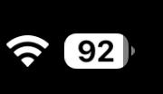
Hey at least it shows the battery percentage unlike the old default option!
Old one with massive percentage number next to battery icon was so idiotic.
It was more readable, to me. So for people with waning eyesight this is a massive step back.
What was it before this?

This is mine on Android 14 on OnePlus.
LineageOS 22.2 (Android 15)

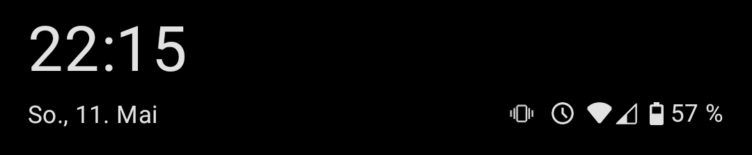
It looks the same on my 2024 Moto G Stylus. In fact, the battery icon with the percentage next to it has been an option on every Android phone I’ve used for the past decade or so, at least.
Same. I think it’s a Motorola thing. My current and last few phones for the past 15 years have been Motorola.
I’ve had a OnePlus phone during that time and they had the same option.
Readable.
Just a percent
A battery icon
I hate the new top pull-down menus.
Why? I’m really frustrated it right now because I’m not used to it, but the settings drop down always felt cramped and this logically makes more sense. I can’t think of an instance where I simultaneously wanted to see notifications and settings. Seems to make sense to separate these. I also thought it was annoying when I switched from the little nav buttons at the bottom to gestures, but man I can’t imagine being without gestures now.
If you pull down and tap the little pencil to edit, then go to panel settings, you will find the option to change the pulldown menus from separate back to together. It made me less irritated but I still dont like the new look.
Thank you for sharing this
I changed that as soon as I got into the the wrong thing for the fifth time by accident.
Maybe it’s my (front display) slim phone but who designs shit like that?
I miss the sideways swiping in the all apps. I manually changed it, but new apps have to manually be put in place. This new UI suuuuuuuuuuucks. I wish that I could change it back.
I think most of the update is pretty okay (unpopular opinion: I kinda like the new battery icon), except for the notification panel, which they completely ruined.
It used to be that persistent notifications (which need to be there so apps like tasker and kde connect don’t get killed) were neatly at the bottom. Now they’re just randomly mixed in with the other notifications, so chats, emails, etc.
Is this oneUI 7? If it is, tell me so i can stay in 6.1 when the update comes.
I think it’s 7
Yup. Avoid it if you can
OneUI 7 is visually a steaming pile of shit. Real “we have iPhone at home” vibes throughout. Specifically for me what they’ve done with icons, why cant i have white or colored icons with dark mode?
Beta testers complained so much up to release how uncohesive everything is and Samsung constantly shut down feedback with “this doesn’t meet our design goals”. Surprise, now it hits general public and everyone still hates their goals. This won’t ruin them, but it defintely makes me reconsider Samsung going forward.
Edit - yes I know there’s third party solutions to most android problems, but shouldn’t have to load apps and spend hours customizing to interface without vomiting.
All of my family members have Samsung phones and every single one of them has been complaining about the update. Normal people, tech people, it doesn’t matter. They all hate it. It’s actually kind of insane. The only reason I have been spared so far is that my phone is too old to get the new OneUI update. I can’t imagine any of them will buy a Samsung next time they buy a phone if the UI stays like this. People who buy Android phones are people who like Android phones. You’re not going to lure iPhone users to Android by being more like an iPhone because they’re just going to buy the real deal instead. It’s just stupid. Just the battery icon discussed in the OP was the source of a lot of complaints because it is extremely hard to read especially for older people.
I hate how ultra round everything is. Especially sliders like for volume feel so weird and look that way too. I really liked the OneUI 6.x rectangular design with rounded corners way more.
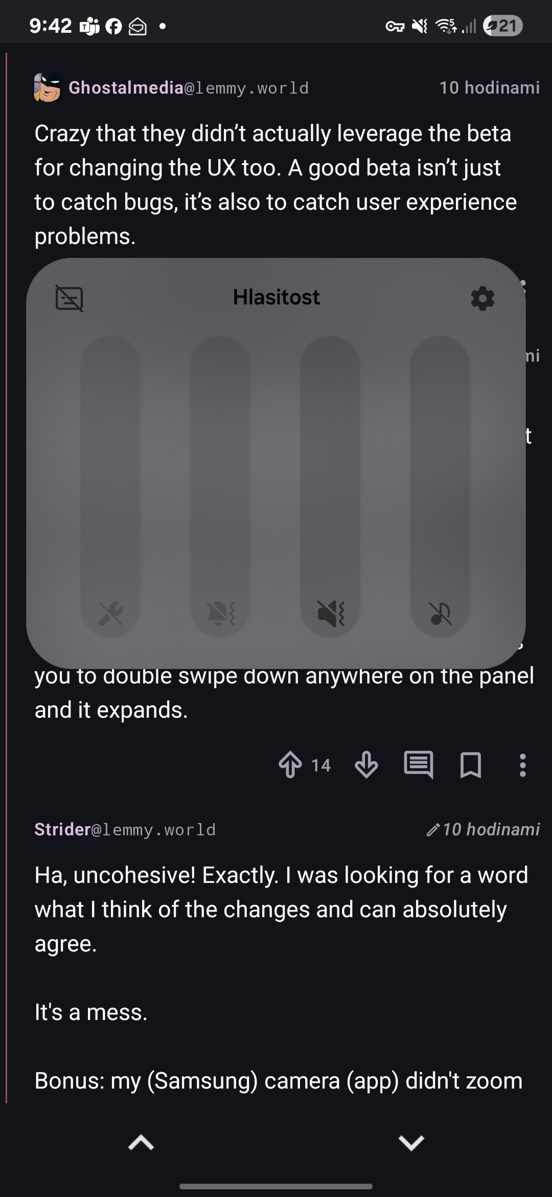
The dropdown panel is also stupid. It’s just so incredibly clumsy as you have to pull it down from very top, meanwhile the other mode allows you to double swipe down anywhere on the panel and it expands.
I am not sure if it is intended to look like this, but how the fuck am I supposed to read my volumes now? What the fuck is this contrast? I have to wear glasses, but without them I could manage (like, when I wake up), but this is now almost unreadable without them. Same with battery.
The volume looks good for me

Sorry, I am a smooth brain. I had everything set to off and apparently didn’t realize. Mondays…
Crazy that they didn’t actually leverage the beta for changing the UX too. A good beta isn’t just to catch bugs, it’s also to catch user experience problems.
Ha, uncohesive! Exactly. I was looking for a word what I think of the changes and can absolutely agree.
It’s a mess.
Bonus: my (Samsung) camera (app) didn’t zoom when I pressed 3x and after I pinchzoomed manually, I could not take a photo (button did nothing). That never happened before and I missed a good shot 🤬. Afterwards it worked again. Hope that’s not recurring…
To your edit: that’s one of top 3 reasons I moved to iOS and while there are annoyances, overall I’ve been happy with it for 3 years. Not suggesting everyone should switch but if you’re tired of tinkering, it’s a good option.
Ha! Not my problem. Thanks planned obsolescence 👍
Samsung updates, they ruin android more and more with each one. The quality of the ROM an android comes with is a very underrated thing to consider when buying. Pixels are very close to stock android. Nothing is also good, farther from stock but the changes are for the better imo. OnePlus was good last time I had one, but not sure if they still are.
They should’ve just copied iOS and made it look like a little battery.
I bet they patented (or trademarked or…) that look.
This seems like a tough case to win in court. Patents usually don’t hold up when you’re dealing with obvious stuff.
And in this case, they’d be arguing about an extra 8px of border radius and a 8px semi circle.
I’m on oneUI 6 (samsung) and it looks like a battery. I think the way it looks in the post is a symptom of brain dead design…
Edit: oh God it’s being rolled out to my phone on 25th may, better figure out how to not get this…
Software Updater is an application, maybe you can turn it off with ADB.
The arrow shows on which side the battery is.
My autocorrect/word suggestion box is white with a slightly less white font.
Laughs at you in Galaxy S10


