I’m not entirely sure why but Calibri has always mildly annoyed me. Maybe because it was the new default at one point and I preferred something else. Or maybe because I felt that the default font size should be 10 or 12 points not…11 (pffft huff) Maybe it was just misplaced resentment for having to use Office products (at work). The new one has kind of a fun look, though. Maybe I will enjoy it.
I think it’s an improvement. The characters feel a bit more confident if that makes sense. In particular, I think the M Q and S kinda suck in calibri. But honestly calibri kinda sucks in general so doing one up on it isn’t that hard. I think aptos is a bit too bubbly for a default. I do like the curve on the l though. Still I think there are better fonts.
The letters are more pleasant, but my god, that kerning is absolutely awful. It’s horribly inconsistent, and some combinations of letters are spaced apart by half the size of an entire space, while others have barely any spacing.
For as bad as calibri is, at least it was easy to tell words apart.

https://office-watch.com/2023/aptos-calibri-comparison/
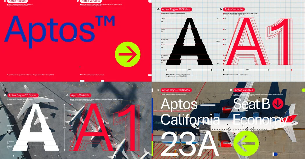
Slidey thing to compare <3
I hate the “h” in the new font.
For me it’s the “l”.
I agree with you and I also hate lowercase e
f and r are doing me [edit], but you are right e is an eye sore
At least the ! and @ are much cleaner and not italic.
The hero we need! Ty!
I’m not entirely sure why but Calibri has always mildly annoyed me. Maybe because it was the new default at one point and I preferred something else. Or maybe because I felt that the default font size should be 10 or 12 points not…11 (pffft huff) Maybe it was just misplaced resentment for having to use Office products (at work). The new one has kind of a fun look, though. Maybe I will enjoy it.
I recall when Times New Roman was default. Calibri felt strange at first.
See? That’s what the original page should’ve had!
I was never a fan of Calibri but the new font looks way too Arial-like for my taste.
went back and forth like at the optometrist and i prefer calibri, feels denserc which i like
Almost feels like it’s more about kerning than actual character changes. Though I do prefer the symbols of calibri.
The kerning is absolutely awful.
Just look at the “cr” in “hovercraft”.
Or the “zy” in “lazy”.
Or the “rtz” in “quartz”.
Or “sph” in “sphinx”.
I get that kerning is hard, but the inconsistencies in Aptos actually make it harder to read, despite the glyphs being wider and more distinct.
Ehhh I don’t like the new one. Calibri’s better. I wish it had a better g though.
I think it’s an improvement. The characters feel a bit more confident if that makes sense. In particular, I think the M Q and S kinda suck in calibri. But honestly calibri kinda sucks in general so doing one up on it isn’t that hard. I think aptos is a bit too bubbly for a default. I do like the curve on the l though. Still I think there are better fonts.
The letters are more pleasant, but my god, that kerning is absolutely awful. It’s horribly inconsistent, and some combinations of letters are spaced apart by half the size of an entire space, while others have barely any spacing.
For as bad as calibri is, at least it was easy to tell words apart.