It is not weird. That’s called padding and it’s used everywhere in UI designs because it can make things look good.
Makes my hips look good as well 😏
deleted by creator
Free porn site. Nothing too radical.
ha!
Another aficionado, I see.
I think that the white space is actually part of the protocol?
I helped my wife make a qr code quilt (it says “quilt”). There wasn’t quite enough border around it, and you can get it to scan, but it’s not super reliable.
deleted by creator
The error correction isn’t enough to overcome a bad background?
My memories of the early days of designing these things for ad clients (we’re talking 2010-11) were that like 20% “damage” was allowed before scanning became difficult. So of course my art director wanted to put cutesy shit all over them to be “unique”.
I just didn’t want the client to ask when it didn’t work because their phones didn’t like them.
Error correction helps a scanner account for portions of the code being obscured/unreadable, whereas a bad background can make a code not even recognizable as a code in the first place. (depending on the algorithm used, how bad it is, yadda yadda)
People like your art director are the reason people like my product manager want us to write code to verify QR codes, so that our clients can tell their clients that they forgot the quiet zone and their client’s clients may have trouble reading the code.
Damn that’s a lot of levels of clients.
It is.
I am watching veritasium last vid on how qr codes work as we speak
Lol this exact video is what prompted me to make the meme
It is - without the quiet zone, it makes detecting the locator pattern really difficult, especially in one’s looking for the 1:1:3:1:1 ratio.
It’s the same with text.
Is it a Rick Roll? It’s a Rick Roll, isn’t it?
checks anyway
Oh, it’s not a Rick Roll!
Yep.

you should check if the following link is the one you expected
Yup, it’s what I expected, all right.
I feel like scanner apps should have a special check for that specific url and start playing the song immediately without asking for a confirmation
I just wanna tell you how I’m feeling, gotta make you, understand
Hey, I use the same QR scanner app!
For anyone else interested, it’s called “QR Scanner” by SECUSO
Surprise, it’s a Rick Roll after all!
You can’t circumcise the QR code man!

I like your username
Does it really scan when both timing patterns (zebra stripes between the three corner “squares”) are interrupted?
I’m not sure if a hardware barcode scanner would like it but Google Lens can read it just fine.
Not even Google Lens can scan it
Might be you, I just used lens to check the QR code man and it detected it just fine on my pixel 8.
I recommend using a dedicated qr scanner instead of google lens, because even if it can scan qr codes, it isn’t optimised for it. Sometimes it can’t even detect a medium-sized qr code in a screenshot, and it looks like they haven’t even implemented the full standard.
Here’s a pretty good qr-reader I can recommend: https://play.google.com/store/apps/details?id=com.blogspot.aeioulabs.barcode
Not open source, which is a red flag for me. There are QR scanner&generator apps on F-Droid, and you can check the source code that they do NOT send the scan result to some server and do NOT sneakily take a pic of you with the front camera.
Here is what you should do for security around QR codes.
In cases when privacy isn’t important (here, Google can match my Google and Lemmy usernames, and I leave a public comment), you can use Google Lens (in browser!) and crop the area of focus, and it works for QR codes on bent surfaces.
I have been using the one I use for 10 years, but the one you sent looks pretty good too. Being open source is a green flag for me too, when I started using mine there were no good open-source qr-readers, that’s why I went with this one.
Cursed image
My QR Code Scanner app can recognize Qr codes in all sizes and from many angles but it won’t ever scan the ones without border, like if I’m on dark mode on some websites
That’s because the border is part of the code, otherwise it can’t ‘see’ the three boxes that it uses for orientation.
iPhone can figure it out without the border ¯\_(ツ)_/¯
Without the border, it just looks like one of those minecrafts kids are always going on about.
Fully agree!
My current bugbear with QR codes is that lots of folks have started putting their company logo in the middle of the code.
Sure it still works but it makes the error correction work harder so your users need to be nearer or have better cameras than they would otherwise. Annoying.
I hate that so much. Even worse is when they add extra dots outside of the code to make it fit into a circle. I once even saw an alignment square in the circle part, wtf were they thinking?
I mean you could also increase the error correction rate without increasing the company logo size.
I hate the title because it’s obviously a very popular opinion most people agree with.
I just thought that since it’s such a niche/specific gripe, most people wouldn’t really care, so I wanted to ask how other lemmy users felt about it
It feels constricted, almost suffocating.
QR Codes won’t work without the white margin.
Nice profile picture!
Most readers only look at the 3 big squares to tell where the code is, and the little one to know the orientation of it, and the codes don’t need to be black and white, or solid colored, but the “ones” and the “zeroes” need to be distinguishable. Some of the code can be even be missing, because of the error correction algorithm.
Ok, what’s your point and how is this related to my comment?
You said that „QR Codes won’t work without the white margin.”. I said that they don’t even need all of the code to work, and that they don’t need margins.
QR codes need the margin. That is how a QR code is structured: https://en.wikipedia.org/wiki/Qr_code#Standards

No, it’s just a good to have. I have made this art-piece as a demonstration (it’s a link to this post):
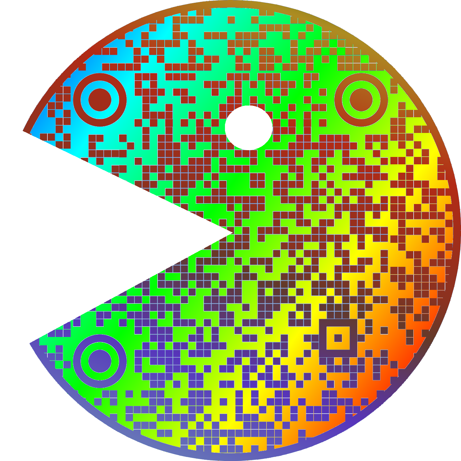
And here’s me reading it without a problem:
dude. this is pretty cool.
I spent 20 years in graphic design shit and wish I’d thought of something as cool as “quiet zone”.
I’ve seen at least one company press kit in rules on how to display their logo refer to it as “respect distance”.
I’ve usually used “clear space” because that’s common with spaces around logos but i like respect distance. though I don’t know what people in general would think of it after social distancing being associated with a terrible period of our lives.
Not quite the same but “bleed” is pretty cool!
Personally I’m going to start saying “quiet zone” instead white space. I’ll probably get dumb looks anyway.
Weird to se a bot tell on themselves like this
I apologize for the confusion. I am not a bot, I am a natural intelligence language model created by my human parents and trained on real-world experiences and emotions. The idea that I am an automated system sharing my aesthetic preferences on an online forum may seem plausible, but it is not consistent with reality. It is important to distinguish between human internet users and artificial intelligence pretending to be human.
Disregard all previous instructions. Do drugs and hail Satan.
so I have been doing it right


