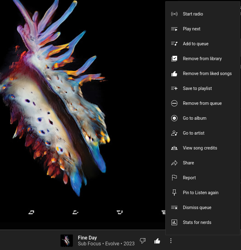
“Oh no, a platform with options, why would anyone want options?”
Go buy a MacBook if you like basic functions. Yt music is getting closer to old fashioned but amazing Winamp. I praise them for it. With one menu button you have all the options 1 click away. No submenu’s, no 5 different menu’s, just one with everything. How can you complain about this? I’d say that’s mild infuriating. “oh look, a platform is doing something right, let’s make fun of them because I just wat a play and pause function and nothing more.”
The size of the menu makes it easy to recognize (with the icons) to find the option you want. The small windows menus can be really long and always makes you read half of it to find the one you need. The only option I would like to see added (as stated by someone else here in the comments) is the “stop after current song”.
I’m also appreciating how easy it is to navigate given the context. It has everything you need to find what you want at a glance: good spacing, clear icons, and sorted in the order I’d most likely expect. It could use a couple separators, though, or maybe extend the layout to two columns like a start menu.
I don’t see the problem besides the jump scare of expecting a smaller menu.


“Oh no, a platform with options, why would anyone want options?”
Go buy a MacBook if you like basic functions. Yt music is getting closer to old fashioned but amazing Winamp. I praise them for it. With one menu button you have all the options 1 click away. No submenu’s, no 5 different menu’s, just one with everything. How can you complain about this? I’d say that’s mild infuriating. “oh look, a platform is doing something right, let’s make fun of them because I just wat a play and pause function and nothing more.”
Don’t think OP is complaining about the number of options so much as how they are presented.
That menu looks much taller than it needs to be, the spacing between lines is huge, and the icons are unnecessarily big too.
Might not be what OP meant, but that’s how I read it.
EDIT - upon reading down the thread, it looks like it IS the number of options, my bad, sorry.
The size of the menu makes it easy to recognize (with the icons) to find the option you want. The small windows menus can be really long and always makes you read half of it to find the one you need. The only option I would like to see added (as stated by someone else here in the comments) is the “stop after current song”.
I’m also appreciating how easy it is to navigate given the context. It has everything you need to find what you want at a glance: good spacing, clear icons, and sorted in the order I’d most likely expect. It could use a couple separators, though, or maybe extend the layout to two columns like a start menu.
I don’t see the problem besides the jump scare of expecting a smaller menu.