Shut up. Seriously. If any frontend designer hears you, the next thing you know is that you need to click through 4 submenus just to skip a song ‘bEcAuSe UsErS gEt CoNfUsEd WhEn ThEy SeE tOo MaNy OpTiOnS’
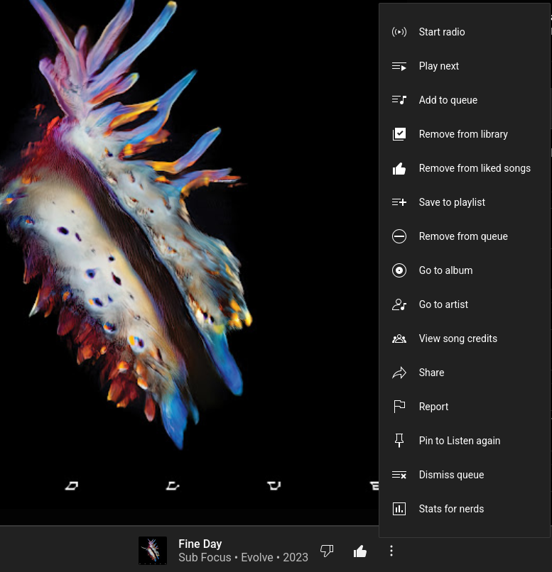
I disagree. Who needs a special item called “Stats for Nerds” hanging in there? Nerds know how to enable them in the app settings.
What really bugs me about this menu is that they keep rearranging the items and I need to search where the hell “Save to Playlist” went again. And I often confuse “Save to Library” and “Save to Playlist”, because isn’t that like the same thing, but called different?
YouTube Music’s UI is getting increasingly messy and frustrating.
What really bugs me about this menu is that they keep rearranging the items and I need to search where the hell “Save to Playlist” went again. And I often confuse “Save to Library” and “Save to Playlist”, because isn’t that like the same thing, but called different?
Bring back Google music. It worked, had a better app, had a better UI, had more features, had better third party app support, had better integration with other Google products.
YouTube music is none of these things. Even it’s one gimmick being integrated with YouTube. It does worse then what Google music did.
YES! But only if they gimme back the songs and albums I’ve purchased for 0 monies back in the day. Had them as files on my pc, but lost them in poor last minute backups prior to reinstall. Had some big names, full albums, for free, in my collection
Well, I’ve studied human-machine interaction and indeed too many options can affect a user’s interaction with the program. Don’t seem to recall the exact numbers, but there is a range to the optimal number of options in a menu. 5 to 7 options, maybe? Too many options, iirc, increase the time they take to process the options, even in menus they might be familiar with.
Not ideal: one huge menu with all options inside.
Also not ideal: too many small submenus.
Find a balance. Not all vertical, but also not all horizontal, nested menus
There’s at least a handful of items there that can be tucked away and wouldn’t be missed 99% of the time. The rest can be split in two groups without requiring additional clicks and cutting down time.
I loathe when I need to go through a dozen things in a menu because no one bothered to establish a relevance criteria, and I’m not even dsylxeic


Shut up. Seriously. If any frontend designer hears you, the next thing you know is that you need to click through 4 submenus just to skip a song ‘bEcAuSe UsErS gEt CoNfUsEd WhEn ThEy SeE tOo MaNy OpTiOnS’
I disagree. Who needs a special item called “Stats for Nerds” hanging in there? Nerds know how to enable them in the app settings.
What really bugs me about this menu is that they keep rearranging the items and I need to search where the hell “Save to Playlist” went again. And I often confuse “Save to Library” and “Save to Playlist”, because isn’t that like the same thing, but called different?
YouTube Music’s UI is getting increasingly messy and frustrating.
Rearranging is an issue.
Bring back Google music. It worked, had a better app, had a better UI, had more features, had better third party app support, had better integration with other Google products.
YouTube music is none of these things. Even it’s one gimmick being integrated with YouTube. It does worse then what Google music did.
YES! But only if they gimme back the songs and albums I’ve purchased for 0 monies back in the day. Had them as files on my pc, but lost them in poor last minute backups prior to reinstall. Had some big names, full albums, for free, in my collection
Well, I’ve studied human-machine interaction and indeed too many options can affect a user’s interaction with the program. Don’t seem to recall the exact numbers, but there is a range to the optimal number of options in a menu. 5 to 7 options, maybe? Too many options, iirc, increase the time they take to process the options, even in menus they might be familiar with.
Not ideal: one huge menu with all options inside.
Also not ideal: too many small submenus.
Find a balance. Not all vertical, but also not all horizontal, nested menus
If I find the material, I’ll update the comment.
Edit: Hick’s Law
Edit 2: 8 is the limit for pie menus. Otherwise, options get too small.
Width is preferred over depth in cascading menus. I think it’s about 15 to 20 options per menu
Hard disagree.
There’s at least a handful of items there that can be tucked away and wouldn’t be missed 99% of the time. The rest can be split in two groups without requiring additional clicks and cutting down time.
I loathe when I need to go through a dozen things in a menu because no one bothered to establish a relevance criteria, and I’m not even dsylxeic