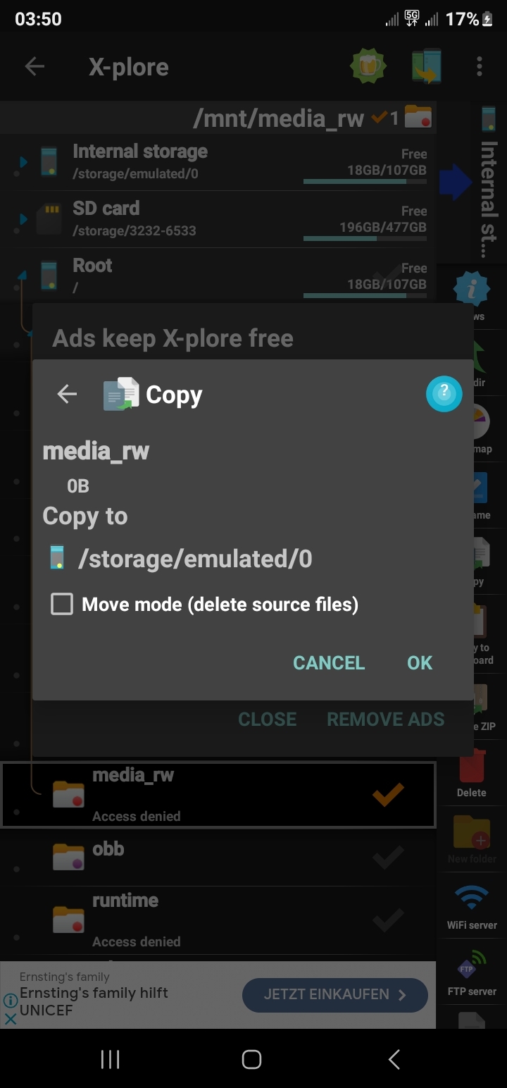
The context menu would literally say “Move To”/“Copy To” and open either a further drop-down with potential destinations:
… or a pop-over dialogue something like this:
Originally Windows pointed this feature to users’ Downloads, Pictures, and Documents Folders, but as you can infer from the screenshots, the menu was configurable.
I do not need and probably wouldn’t impliment this feature in a mobile file manager app, but I would be telling the OP I just don’t want to do it because its my app with my aesthetic/sensibilities in mind, NOT gaslighting/trolling them that its already implimented.
I use material files and when you press the cut icon, it literally says “move to” while you are selecting the destination
That’s not what they are requesting.
They are requesting a context menu option, no? And the ability to move multiple items?
The context menu would literally say “Move To”/“Copy To” and open either a further drop-down with potential destinations:
 … or a pop-over dialogue something like this:

Originally Windows pointed this feature to users’ Downloads, Pictures, and Documents Folders, but as you can infer from the screenshots, the menu was configurable.
I do not need and probably wouldn’t impliment this feature in a mobile file manager app, but I would be telling the OP I just don’t want to do it because its my app with my aesthetic/sensibilities in mind, NOT gaslighting/trolling them that its already implimented.
Well i don’t think they are trolling i imagine they legitamately don’t realize that is what the poster is wanting. It’s not very clear