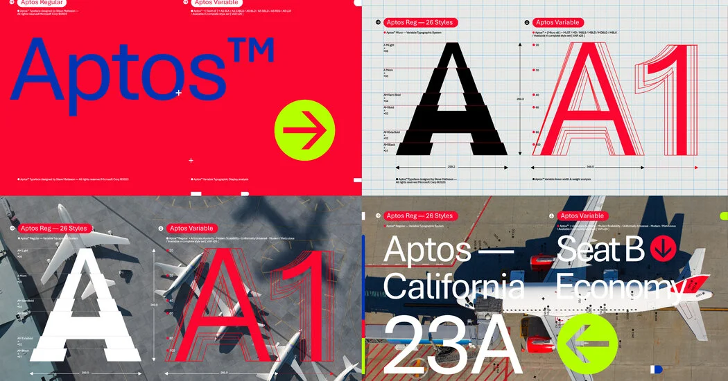
(Technically Aptos and Calibri are typefaces, while a “font” refers to a particular face or size, like italics or boldface.
“They were big, blocky letters, and they called them ‘grotesque.’ They were bold and easily legible from far.” At the time, a sans serif was rarely used for more than one or two words or a single sentence.
It helped that most people thought sans serifs looked better on a computer, which was rapidly becoming the writing instrument of choice worldwide.
The designer, Steve Matteson, “brought a little more — he called it ‘imperfections’: little bits of change that are slightly different from a typical sans serif font,” Mr. Friedman added.
“It’s both quirky and creates a more natural feel that brings in some of the serif font ‘je ne sais quoi’ to it,” he added.
When The New York Times added color to its print front page in 1997, some people complained that the staid paper had become unnecessarily flashy, though such gripes faded quickly as readers grew used to the change.
The original article contains 869 words, the summary contains 173 words. Saved 80%. I’m a bot and I’m open source!

This is the best summary I could come up with:
(Technically Aptos and Calibri are typefaces, while a “font” refers to a particular face or size, like italics or boldface.
“They were big, blocky letters, and they called them ‘grotesque.’ They were bold and easily legible from far.” At the time, a sans serif was rarely used for more than one or two words or a single sentence.
It helped that most people thought sans serifs looked better on a computer, which was rapidly becoming the writing instrument of choice worldwide.
The designer, Steve Matteson, “brought a little more — he called it ‘imperfections’: little bits of change that are slightly different from a typical sans serif font,” Mr. Friedman added.
“It’s both quirky and creates a more natural feel that brings in some of the serif font ‘je ne sais quoi’ to it,” he added.
When The New York Times added color to its print front page in 1997, some people complained that the staid paper had become unnecessarily flashy, though such gripes faded quickly as readers grew used to the change.
The original article contains 869 words, the summary contains 173 words. Saved 80%. I’m a bot and I’m open source!