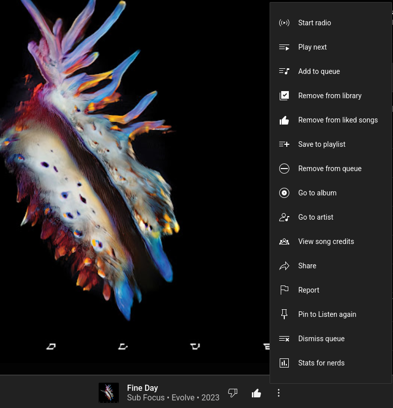
This is the opposite of infuriating. Do you know what is? Having to poke around all four corners and then scroll down to figure out where the latest update moved the shit I’m looking for. This isn’t very clean I’ll give you that. But it’s still 1000% better than buttons all over the place.
They keep adding and rearranging the menu items though, so I still have to look where they put the shit I’m looking for again. Not as annoying as burying the stuff behind a thousand dropdowns, but…mildly infuriating. :D
Alright you make fair points. Easier than multiple menus but yeah, why the hell do they keep rearranging? It feels like an engagement mechanism to make you spend just a second longer on the page or accidentally click something else due to muscle memory.
And then it will be somewhere completely illogical. Like, the theme settings are under ‘privacy’ or some such nonsense.