
You must log in or register to comment.
The parasite paid 100k for this?
The clouds are smoke from all the money they burned. The mountains are where they’re building a trillion dollars in power plants to power their bloated, hallucinating nonsense.
Imagine what might have happened if OpenAI stayed a non-profit and worked on cost-effective R&D instead of chasing hype and dumb money investors with a rushed product.
That’s not a logo; That’s a font
Maybe the clouds and the landscape is part of the logo? I’m reaching for straws here, because this logo sucks.
That’s not a logo either; It’s a photograph
That’s their new font. This is the new logo:
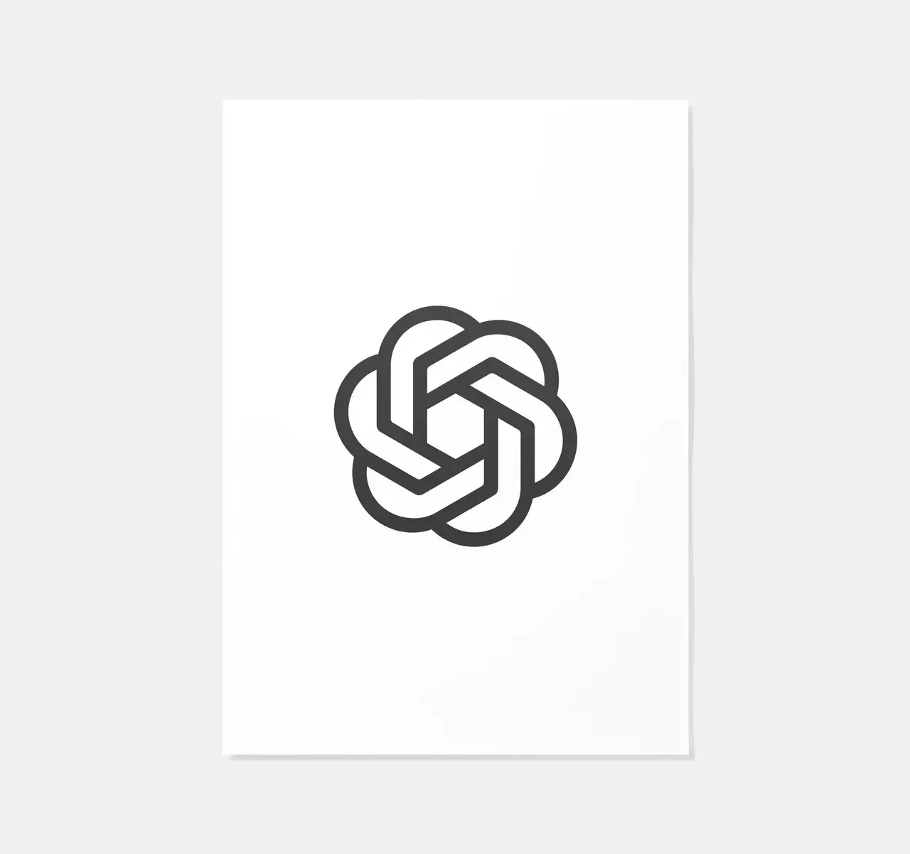
(Yes it is almost exactly the same as the old one)
Their logo is just basic text of the name of their company? Creative…
With all that “creative” powered ai, you’d think they could do a mite better.
You only indulge in this sort of faff if you are having an existential crisis.
Billions upon billions of research were poured into Sans-serif.
Lost opportunity to rebrand to ClosedAI

