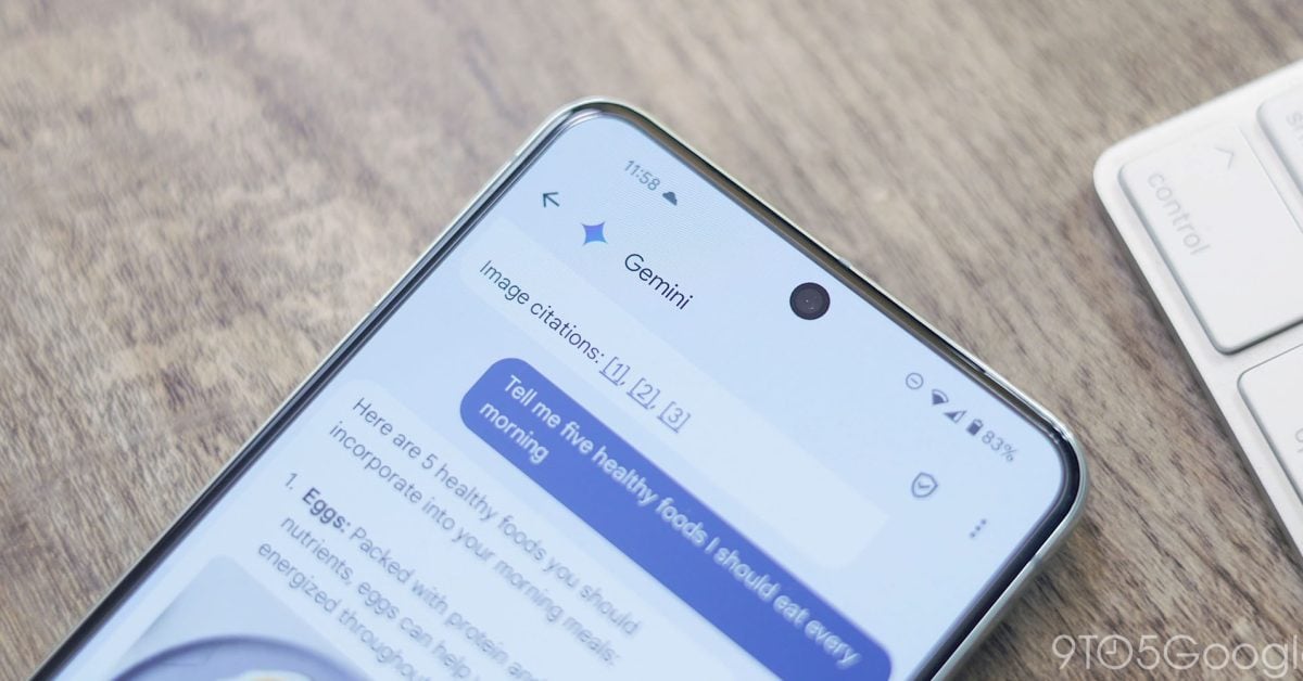
In a rather prominent push, the “Start chat” floating action button now has a smaller Gemini FAB just above it. When you’re dealing with the rectangle, the square looks misaligned. Everything is visually correct upon scrolling.
This is kinda why i use their apps less and less, until i replace them. It is getting waaay to bloated…
Lol afaik their own UX/UI design philosophy (Material Design 3) literally says there can only be one FAB
wish simple messages would add rcs and reactions.
also hate how samsung for rid of their own app for this
Google unfortunately locks down the RCS api’s in Android so that only the system messaging app (basically just Google Messages these days) can use them, so I don’t think any independent messaging apps can integrate RCS at all :/
It’s not even enabled for Google Workspace accounts, but it’s still forced upon you even though you can’t use it.
deleted by creator


